
Driving Auctions Year 1 Growth with 30+ UX Improvements
Hagerty Marketplace
Role & contributions
Lead Designer — concepting, competitor analysis, gathering user feedback, feature prioritization
Impact
Delivered 30+ UX enhancements after MVP launch, establishing a scalable foundation for product growth and driving engagement and adoption of the product within its first year
Moving a new product past its MVP
The challenge: Hagerty Marketplace Auctions launched as an MVP in a competitive space alongside many digital auction platforms. My job in year one was to rapidly identify and close the gap between where the product was and where it needed to be while also supporting business growth.
The complexity: Unlike most products, this marketplace served three distinct user types simultaneously: buyers, sellers, and an internal operations team. Each had their own needs and friction points.
My approach: To capture what needed to be done systematically, I built a quarterly audit process to identify, prioritize, and ship improvements in close collaboration with product, engineering, and operations.

Two major goals for one product
The business goal for the first year was to “Deliver an unmatched Marketplace” with the two product focuses being:
Generate demand: Build a network of buyers and sellers who trust Hagerty as the source for buying and selling collector vehicles.
Nail the beautiful basics: Build upon the MVP by delivering UX improvements and new features to get the product to baseline with competitors.

Improving the product while balancing different user needs
In Hagerty Marketplace, there is the unique design challenge of servicing 3 different types of users simultaneously. It is a two-sided marketplace with buyers (bidders) and sellers (consignors), all of whom are supported by an operations team.

How I identified and prioritized what to build
Each quarter I audited the platform end-to-end, documenting UX gaps and feature opportunities across all three user types and also supplemented with ad hoc audits as business priorities shifted.
Prioritization was collaborative, using an impact/complexity framework with product, engineering, and business stakeholders. High impact, low complexity items were fast-tracked as quick wins while larger efforts were sequenced around them.
While I worked closely with the product manager, I largely led design decisions and owned the direction from problem framing through to final design solution.


An overview of 30+ UX updates
As shown in the list below, I identified and delivered many solutions in the first year of the product. I’ll expand on a few of the most impactful in the following sections.

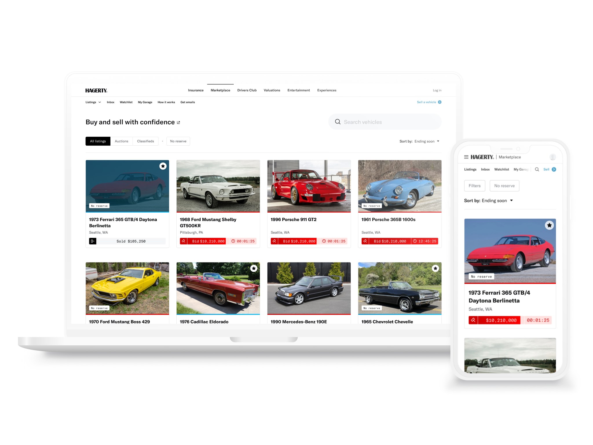
Optimizing the homepage for clarity and density
The original homepage had poor hierarchy and buried the platform’s value proposition, making it hard for new visitors to quickly understand what Hagerty Marketplace offered. Large feature cards also limited inventory visibility above the fold, reducing the browsing density that drives engagement on a marketplace.
The redesign addressed this by leading with a clear value proposition statement, switching to a denser inventory grid, and embedding a newsletter callout to capture new users and build the platform’s audience.
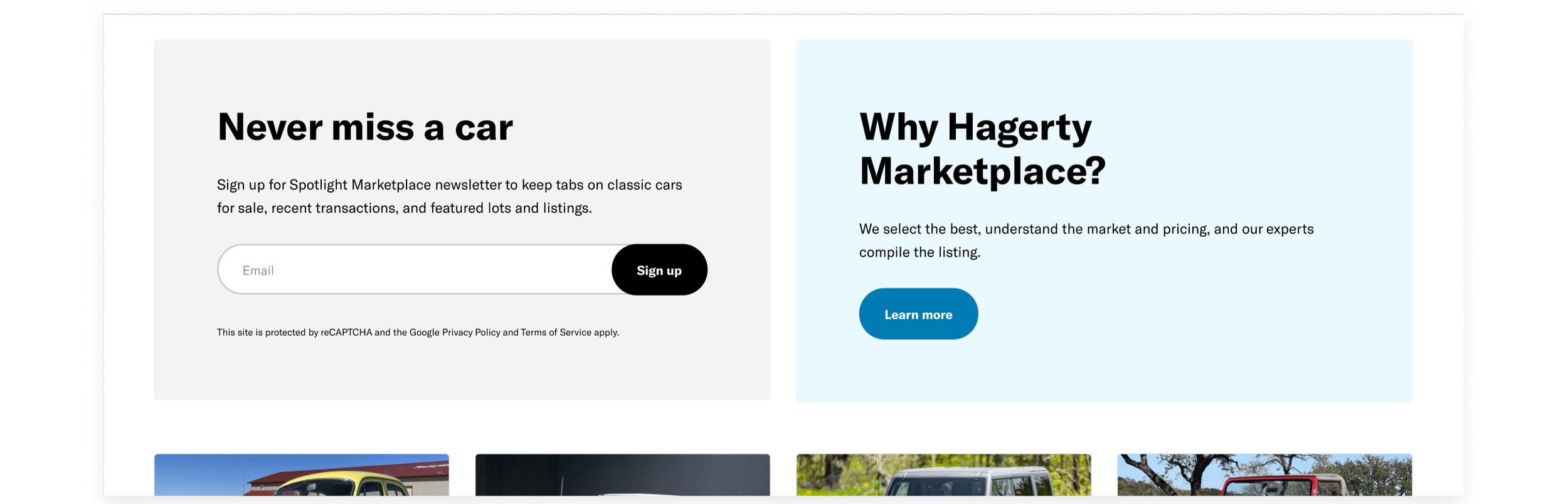
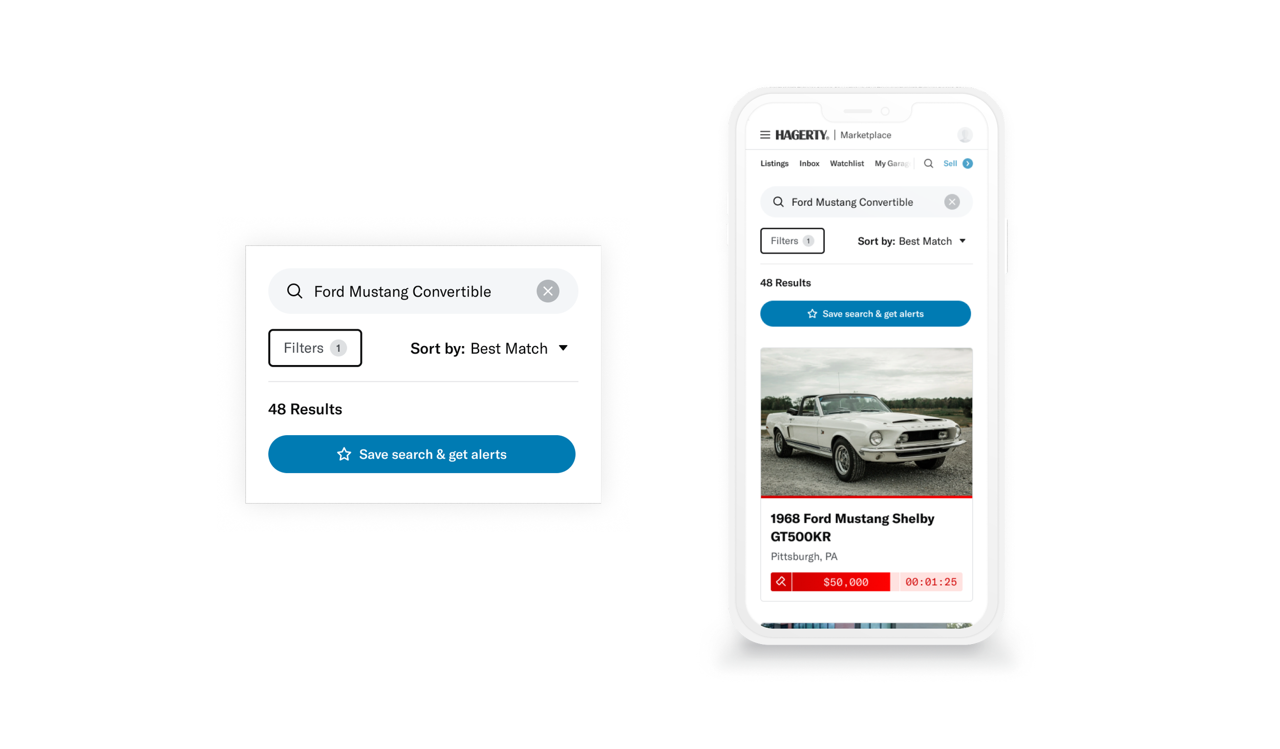
Bringing high-intent buyers back with saved searches
With limited early inventory, buyers would often visit without finding the right car and leave with no reason to return. Saved searches with daily email alerts solved this by re-engaging users the moment a matching vehicle appeared. Within six months the feature drove 2,700+ opt-ins with 50%+ email open rates and 12%+ click-through rates.
See the full case study for a deeper look at this feature.
Turning listing pages from dead-ends into discovery
Most traffic arrives on individual listing pages via the daily newsletter or ads, so users who weren’t interested in a specific car had nowhere to go. We did not present obvious browsing opportunities, so these listing pages were effectively dead ends.
To fix this, I added a right rail showcasing live auction inventory, giving users a path to keep browsing and stay engaged. Since the existing right rail that contained listing details remained fixed, I implemented a sticky action bar so that information could follow the user while scrolling, which freed up the rail for discovery.
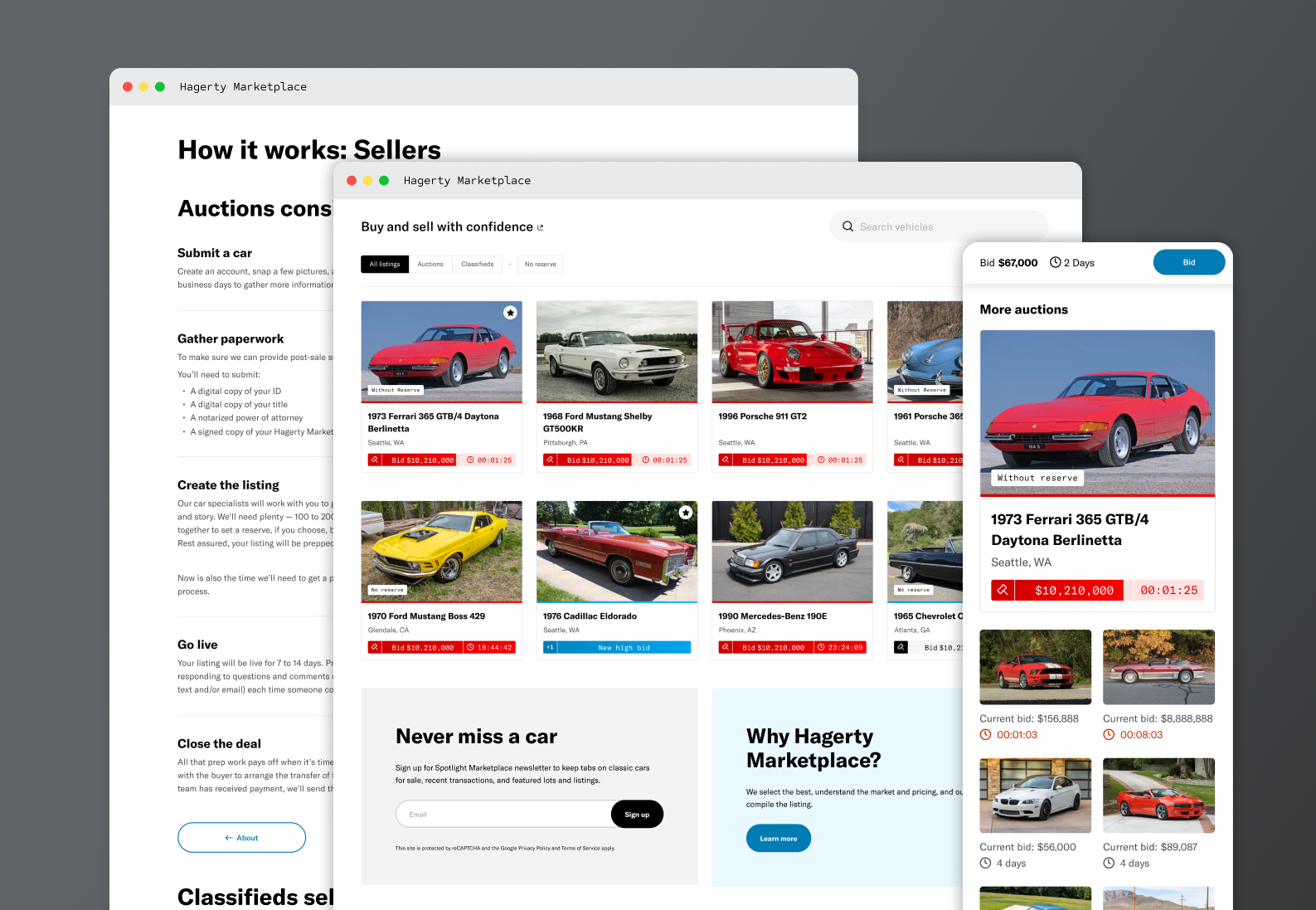
Clarifying the value proposition on the “About” and “How it Works” Pages
The previous About and How it Works pages split the experience between auctions and classifieds from the start, without first establishing what made Hagerty Marketplace worth using at all. Users had to navigate into a selling or buying path before understanding our value.
The redesign led with the overall value proposition upfront, then guided users into the relevant path, whether it was buying or selling via auctions or classifieds.
Year one impact stats
Delivering 30+ UX enhancements in year one established the foundation for a product that buyers and sellers could trust. The results reflected that: 4.2M unique visitors, 62.1k accounts, 347 cars sold, and $908k in revenue, all within the first year of launch. The patterns, processes, and design foundations built during this period directly informed the eventual broader UX overhaul of the Marketplace platform that followed 2 years later.
