
Scaling Engagement 3.7x Through Core Marketplace UX Redesign
Hagerty Marketplace
Role & contributions
Lead Designer — concepting, design systems, prototyping, gathering user feedback, leading XFN collaboration
Impact
Core UX overhaul of Hagerty Marketplace, optimizing information density, browsing, and engagement, which drove a 3.7x increase in weekly saved searches

Redesigning the core search and browse experience
Business problem: Launched in 2022 as an MVP, the Marketplace platform was built to get to market, not to scale. As auction volume grew, the platform struggled to support density, discovery, and engagement. Vehicle cards were oversized and hard to scan, filters were disjointed, and there were limited surfaces to showcase curated inventory or capture high-intent users.
User problem: Users struggled to find, track, and return to the cars they cared about. Navigation broke down across search and filters, results didn’t include past auctions by default, and opportunities for saving a search was easy to overlook.
3+ years of learnings and feedback
Problems were surfaced through three sources: user interviews conducted by our product team, direct feedback from our operations team who work closely with buyers and sellers daily, and session recordings that showed how users actually navigated the platform. Together, these inputs painted a consistent picture: users were losing their place, missing key actions, and working harder than they should to find the right car.
Internal release announcement summarizing the scope of user-centered enhancements shipped in v25.4.2
Part 1: Main page redesign
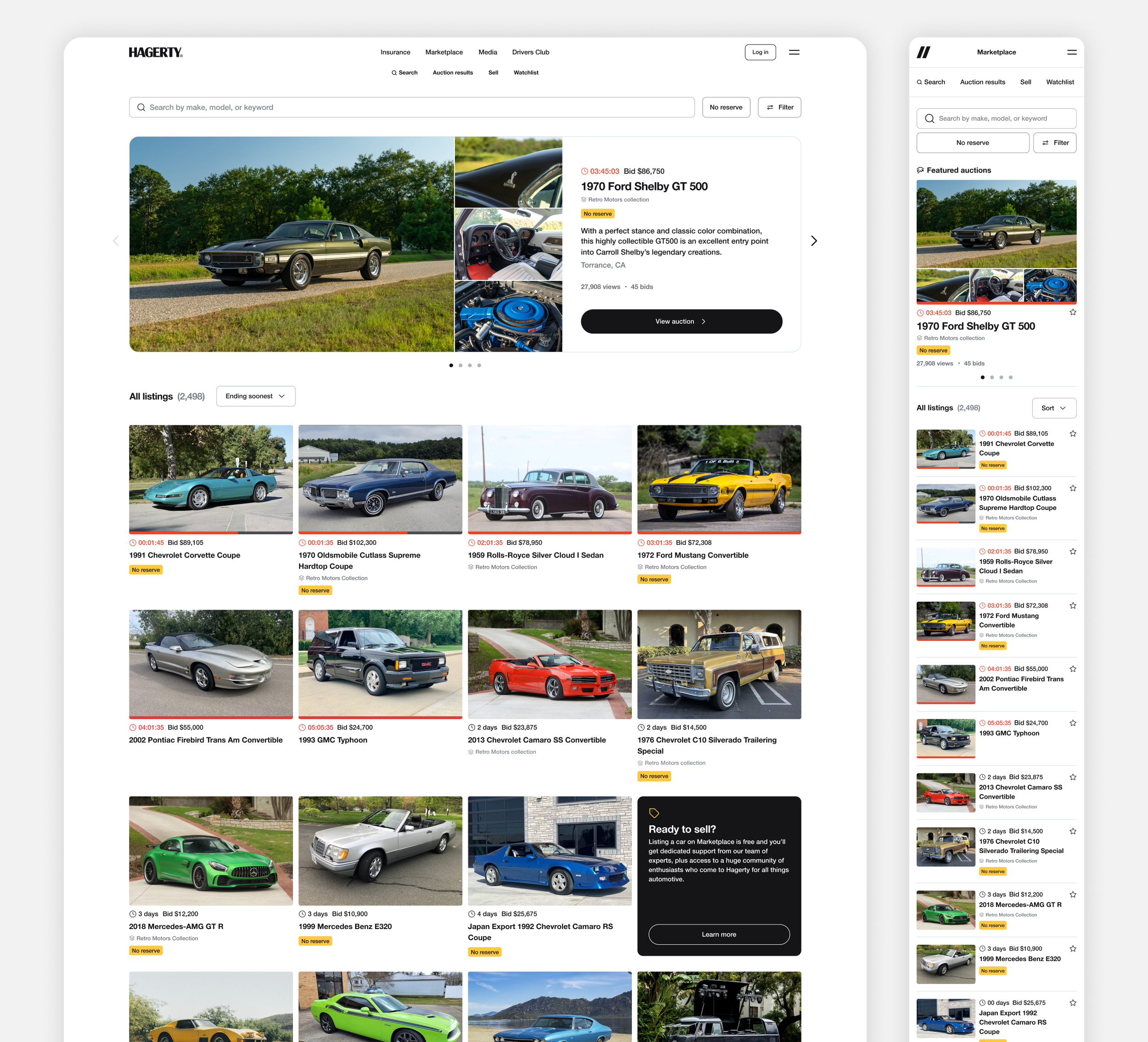
What the main page got wrong
The main page displayed listings in a grid of large, visually cluttered cards that prioritized size over scannability. Static promotional callouts were hardcoded into the layout, giving the team no flexibility to surface curated inventory or react to what was happening on the platform. Users who clicked into a listing and returned also lost their scroll position entirely, with no easy way back.
Marketplace main page—before
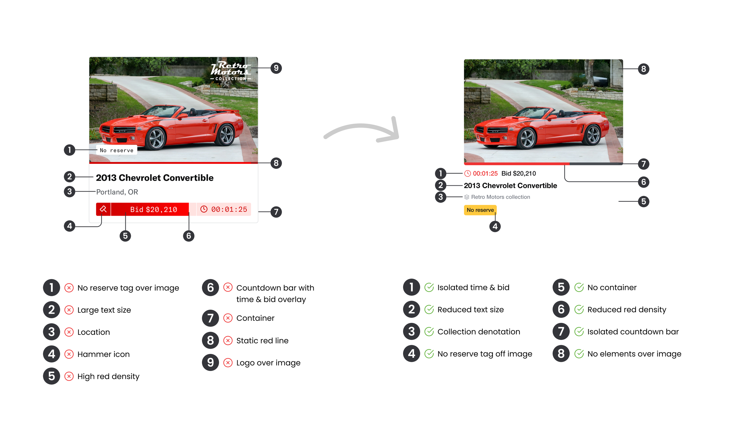
Redesigning vehicle cards for density and clarity
The new card design strips away the noise, removing elements overlaid on the hero image, tightening the information hierarchy, and reducing visual weight so the car itself does the selling. Auction-specific details like countdown timers and collection attribution are now cleanly separated and easier to scan at a glance.
See full case study for a deeper look at the new vehicle cards
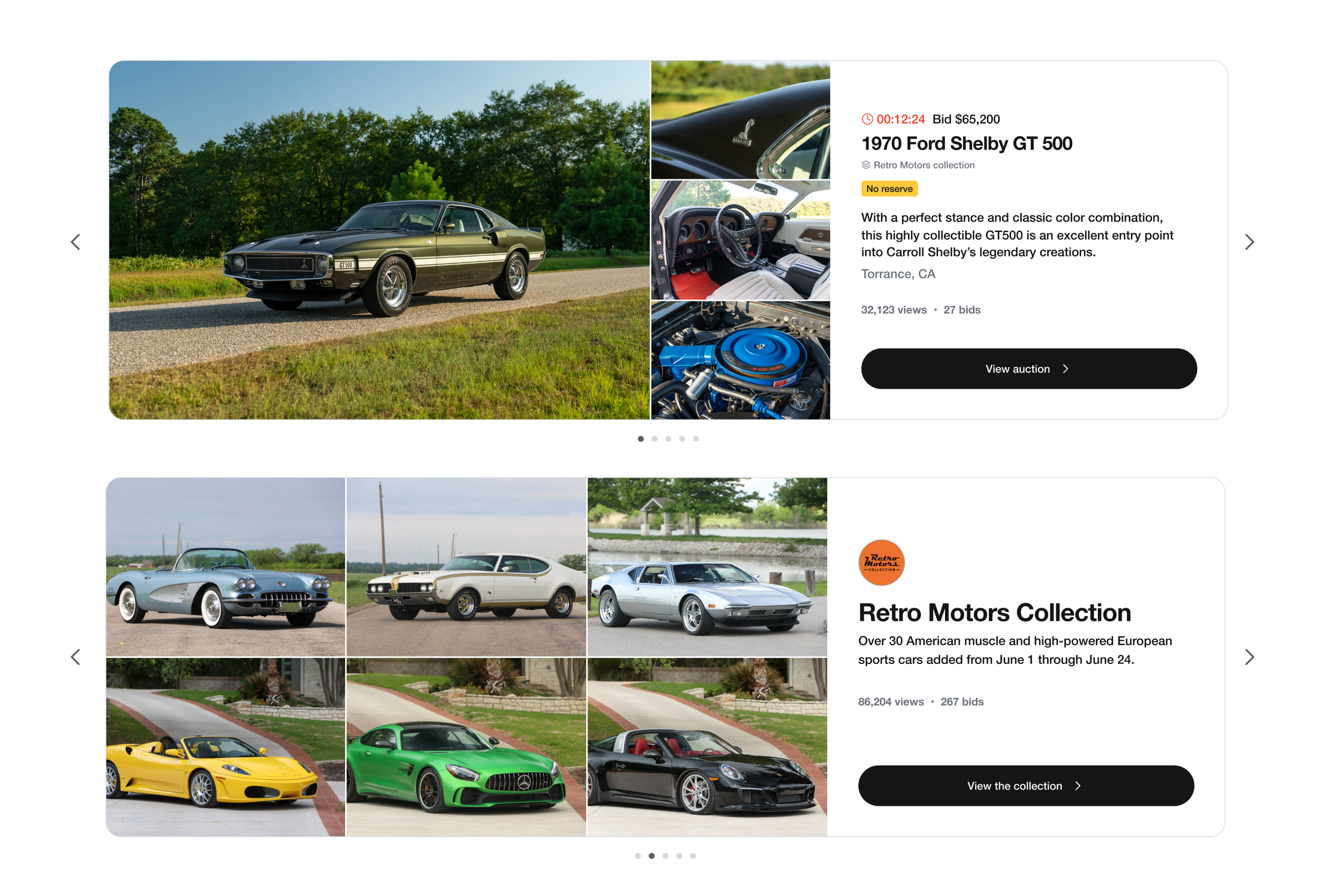
Introducing a featured listings carousel to the main page
To give the team a dedicated surface for curated inventory, we introduced a featured carousel at the top of the main page. It supports both individual vehicles and themed collections, giving Ops and Marketing a flexible canvas to highlight what's most relevant without disrupting the browse grid below.
Replacing static callouts with embedded dynamic cards
The old main page used hardcoded promotional blocks that couldn't adapt to context or user state. The new approach replaces these with a grid of dynamic callout cards embedded inline within the results, surfacing actions like saving a search, signing up for the newsletter, or listing a vehicle exactly when they're most relevant.
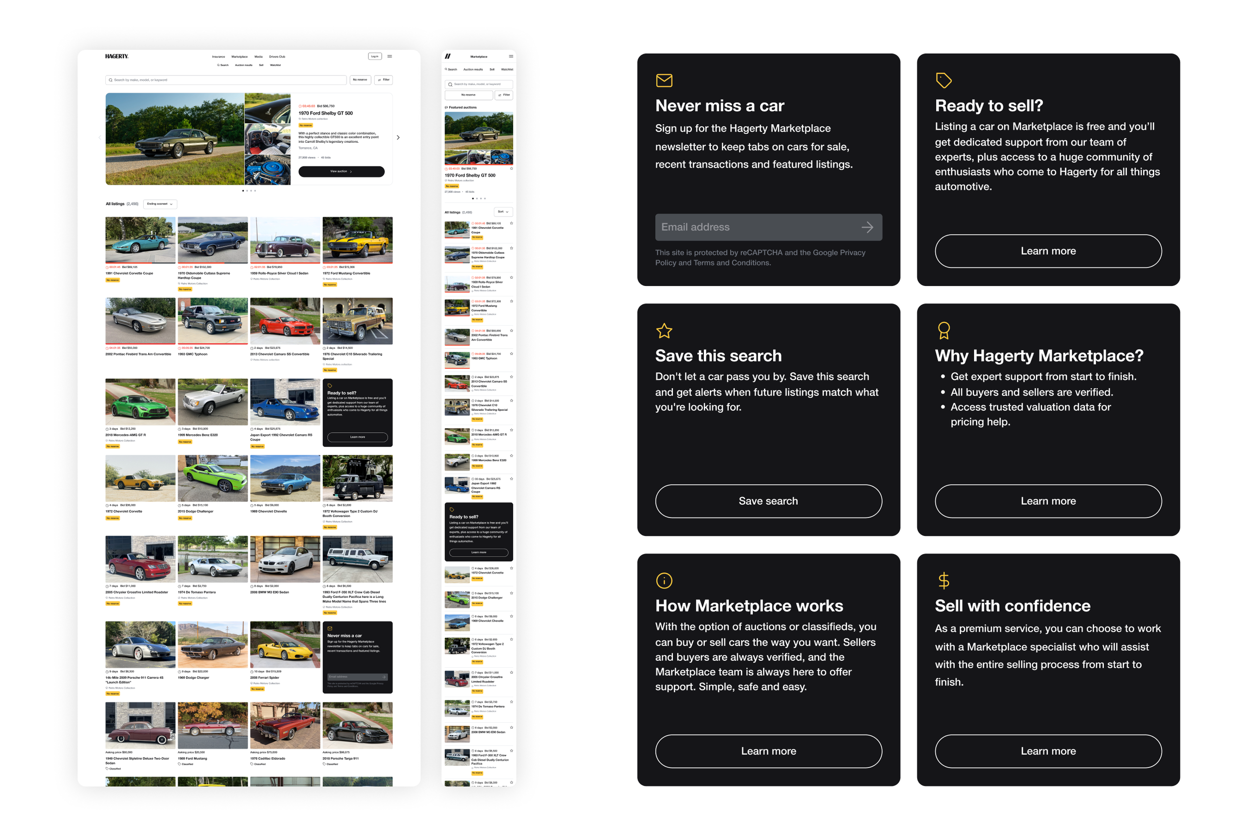
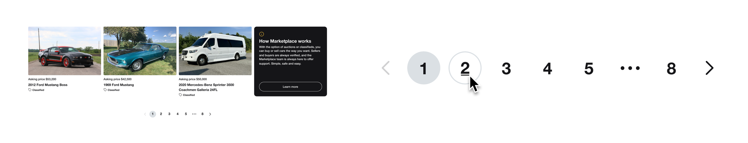
Switching from “Load more” to numeric pagination
Replacing the "Load more" button with numeric pagination communicates the true depth of the catalog and gives users a reliable way to return to a specific page after navigating away — a small change with a meaningful impact on how browsable the main page feels.
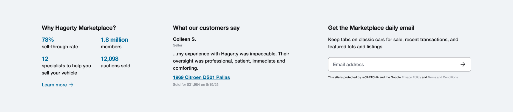
Anchoring the platform with a value prop pre-footer
A new persistent pre-footer section reinforces why Hagerty Marketplace is worth coming back to: sell-through stats, member count, rotating seller testimonials, and a newsletter signup. This turns the bottom of the main page into an engagement and trust-building opportunity.
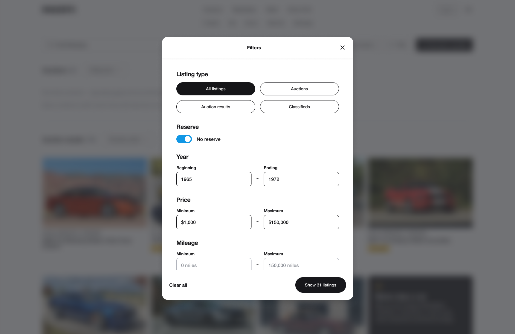
Part 2: Search redesign
What the search experience got wrong
The search experience had all the right pieces, but they didn't feel connected. Search, filters, and save search lived in the same UI without feeling related, and the filter experience was clunky across the board. Past auctions were hidden behind a filter, so a search with no results just hit a dead end which was a missed opportunity to show buyers and sellers that this inventory exists and successfully sells.
Marketplace search/filter—before
Unifying search, filters, and save search into a coherent UI
The redesigned search experience treats search, filtering, sorting, and saving as a single system rather than separate functions. All controls are logically grouped and accessible from one place, reducing the cognitive overhead of navigating between them and making the search experience discoverable at a glance.
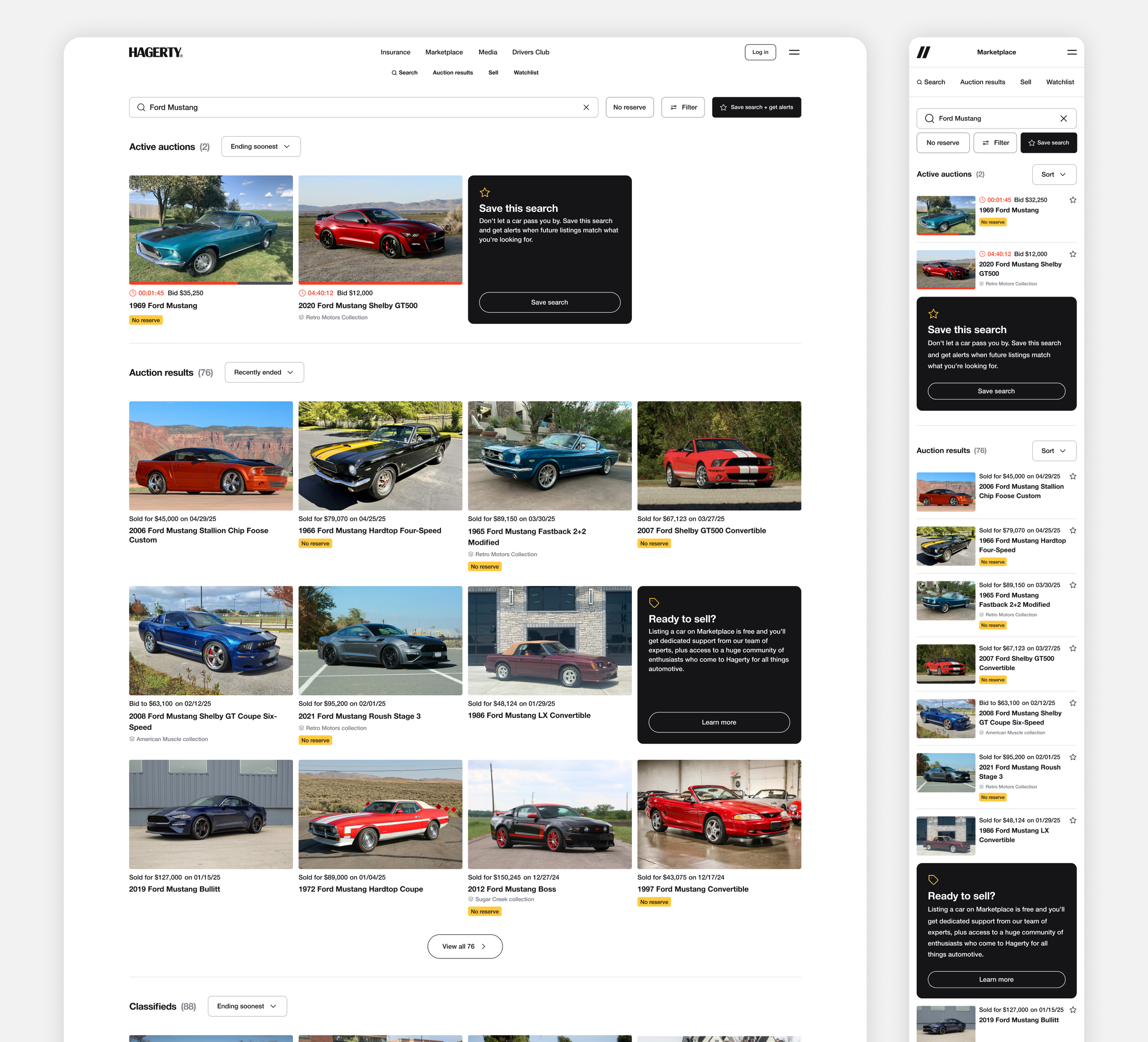
Streamlining the filter experience for desktop
The old desktop filter panel exposed every option at once, each requiring its own individual action to apply. Make and model filters were effectively broken too, where free-text entry on classifieds led to inconsistent spellings that were never reconciled. Since most users were already typing make and model into the search bar, we removed those filters entirely and eliminated the conflict. A single modal now handles everything else, with result counts updating in real time and room to scale as new filter types are added.
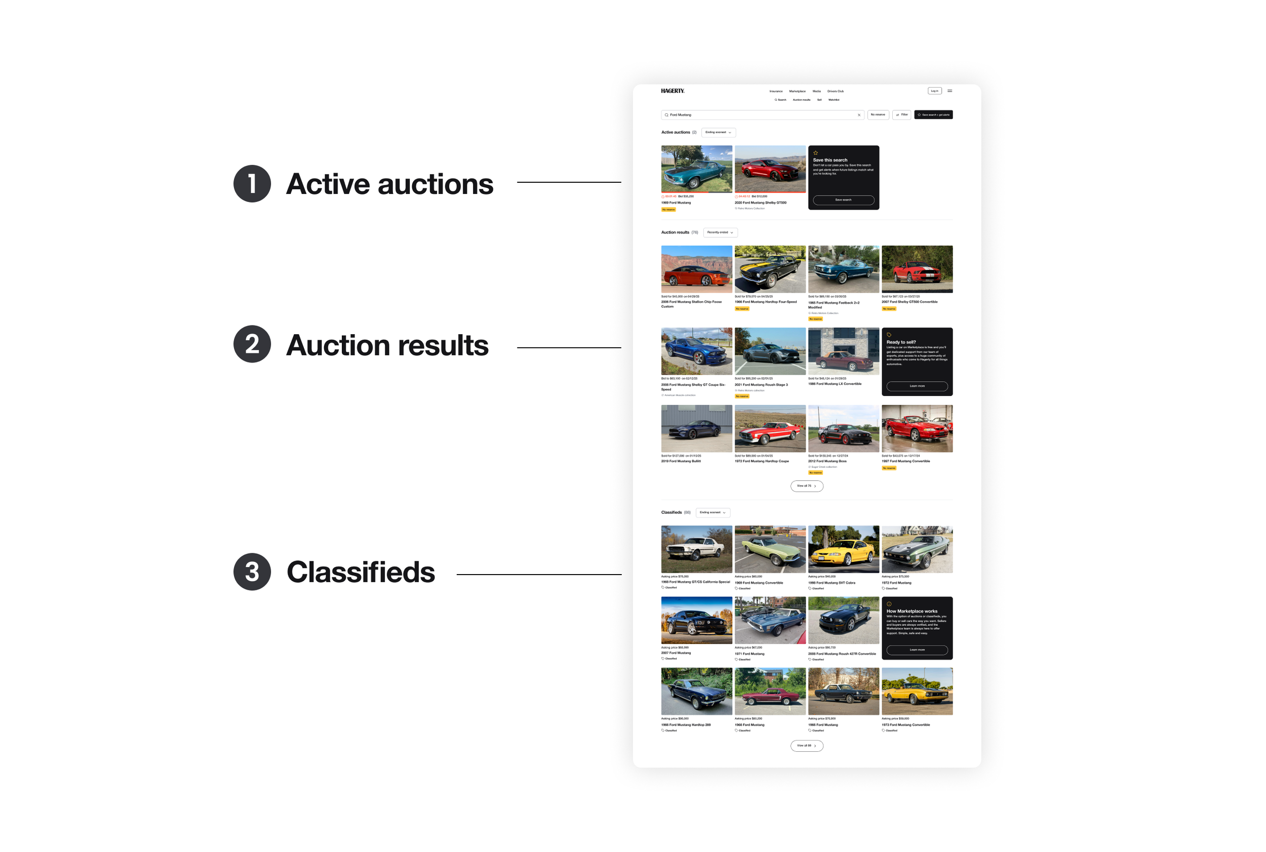
Smarter search results, with built-in engagement opportunities
Auctions and classifieds were served in one undifferentiated list, and past auctions were hidden behind a filter. The redesign sections results into three groups: live auctions, past auctions, and classifieds. Surfacing past auctions gives buyers confidence that this inventory exists on the platform, gives sellers proof that these vehicles sell here, and gives everyone a reference point for what similar cars have sold for.
Inline callout cards woven throughout also create natural touchpoints for engagement, prompting users to save a search, list a vehicle, or sign up for the newsletter wherever they are in the browsing experience.
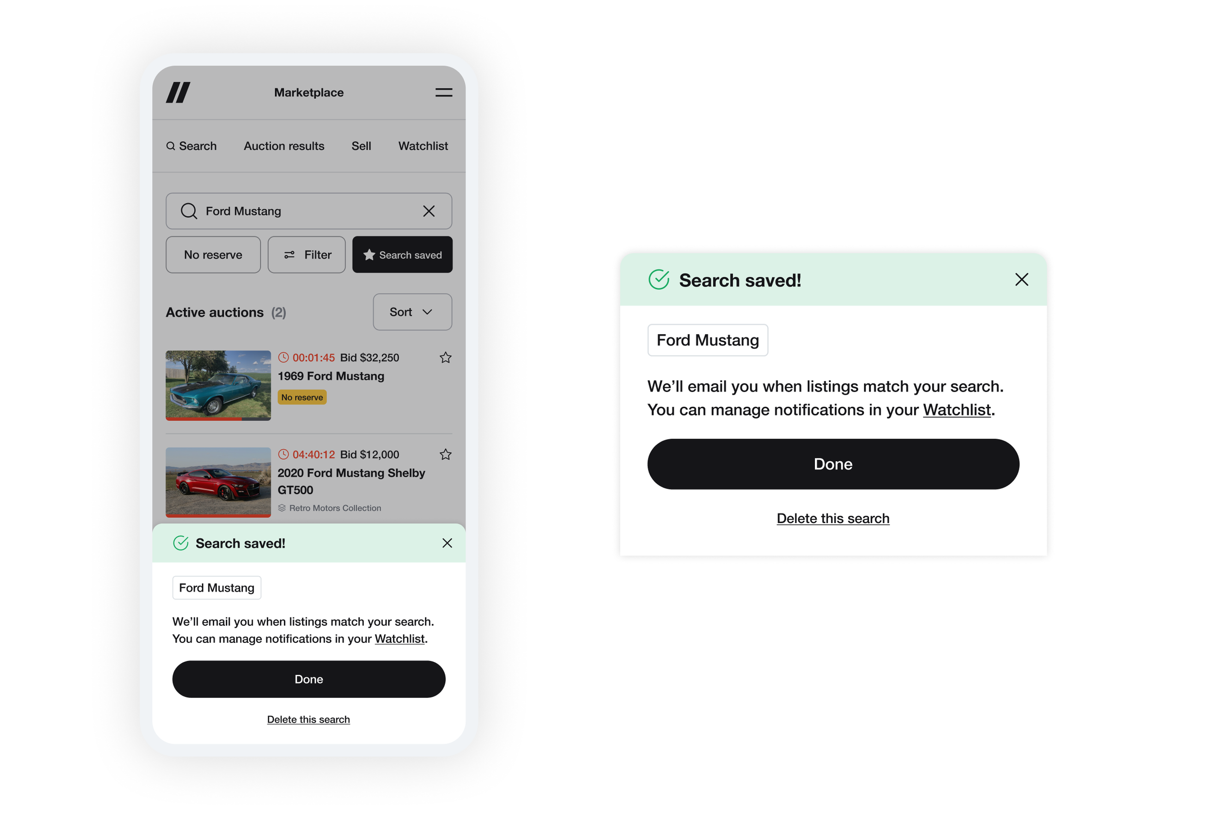
Making the save search confirmation do more
The previous design confirmed a saved search with a toast that disappeared automatically, offering little more than a quick link to the watchlist. The new design replaces this with a confirmation modal that shows the exact search term saved, explains what happens next, and requires acknowledgment. It creates an education moment around where to manage saved searches, reduces accidental saves, and sets up a natural path to scale: editable search terms could live directly within that same flow down the line.
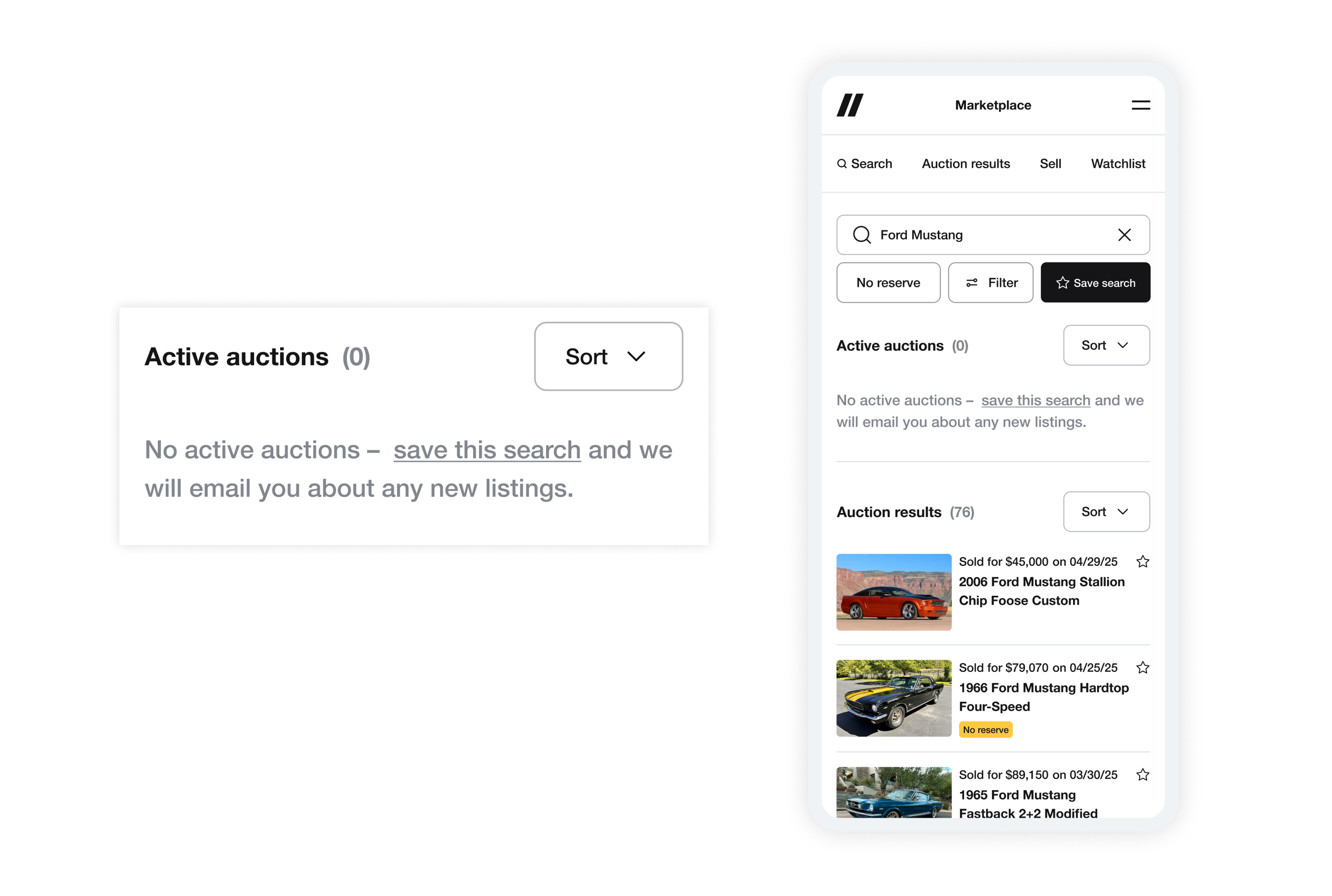
Turning zero results into a save search moment
With past auctions now surfaced by default, most searches that previously felt empty now show real reference inventory. Save search is reinforced throughout the experience via inline callout cards within results. In the rare instance that a section returns no results, an empty state prompts users to save their search and get notified when something matching is listed
Impact
Saved searches grew 3.7x, a strong indicator that users are finding the search experience more valuable and are invested in coming back. Inline callout cards are seeing consistent interaction, validating the concept of embedding engagement opportunities directly within browse and search results. The featured carousel has also shown early traction, with curated collections and special vehicles generating more engagement for listings.
3.7x
increase in saved searches